Case study for
Anchor Oenology
WordPress Website Redesign
Introduction
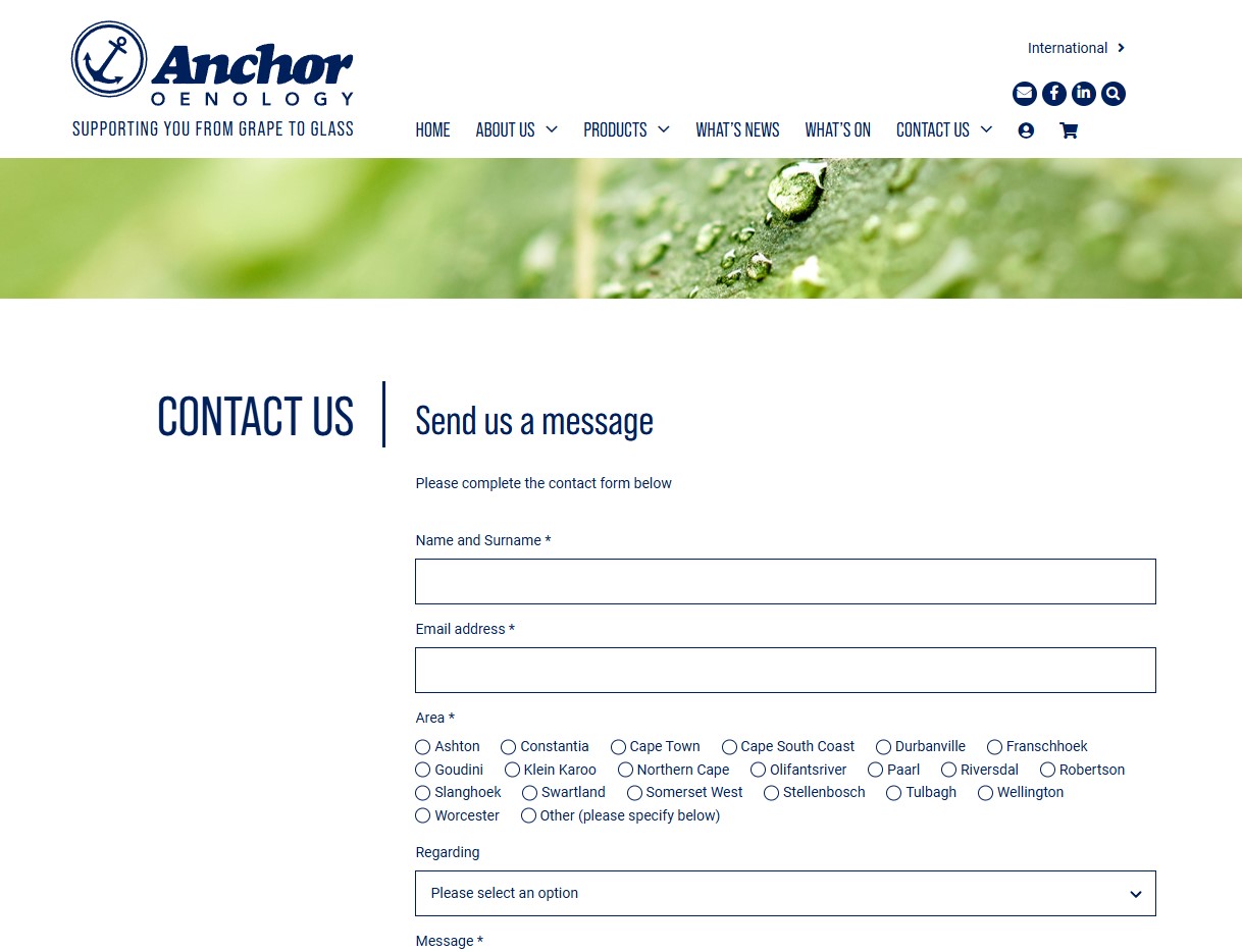
For Anchor Oenology South Africa, I redesigned the website to improve navigation, showcase their updated brand, and introduce features like product categories, a downloads library, team profiles, news integration with Mailchimp, and secure client logins for pricing.
Project Overview
Anchor Oenology South Africa approached me with the goal of revamping their old website to better reflect their refreshed brand identity. The focus was on creating an intuitive, user-friendly experience that would streamline navigation and showcase their offerings in a professional and organized way.
To achieve this, we outlined the following key features:
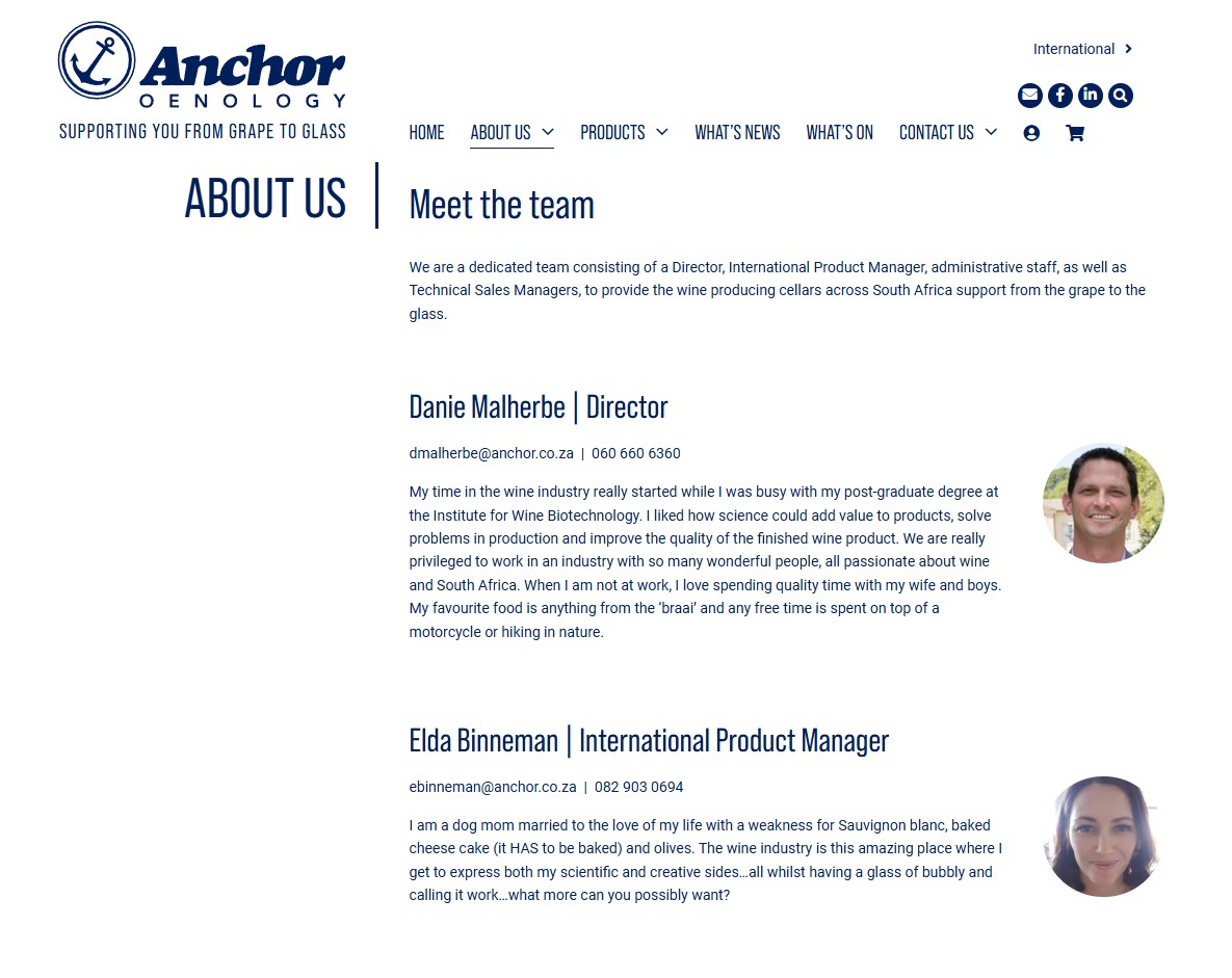
Comprehensive Product Listings: Organized into categories for easy browsing, allowing users to find products by type or category. Downloadable Resources: A dedicated section for downloadable files and documents, providing valuable resources for clients and industry partners. Team Introduction: A team list on the About page, helping clients get to know the people behind the brand. News & Updates: A news section, complete with links to Mailchimp for subscribing to newsletters and updates. Client Login for Pricing: A user login feature enabling registered clients to view product prices, ensuring that critical information is accessible only to authorized users.
These goals guided our approach to create a more modern, functional, and visually appealing online presence that aligns with Anchor Oenology's branding and serves its clients effectively.

My Role
I interpreted Anchor Oenology South Africa’s vision to design and develop a user-friendly site that highlights their refreshed brand. Working closely with the client, I crafted the page layouts and managed the entire build, while Maxim assisted in programming the custom directory navigation for product categories.
Planning & Research
We had discussions with the brand's designer to align the website's look and feel with their refreshed brand identity. We also reviewed several websites known for their excellent user experience (UX) to gather ideas. Our primary focus was on incorporating large images and creating an engaging page scroll effect to enhance the user experience and showcase the products effectively.


